Overview
Problem: Currently, wineries have some difficulty promoting their events to potential visitors, and wine lovers need a consolidated platform to discover new wineries and wines. Many wineries are understaffed and have to use multiple software tools to manage inventory and social media.
Solution: A digital marketplace for wine. Wine consumers discover new wines and wineries through the Palate app, while winery owners enter information through the portal. Palate also wants to leverage data about consumers to provide better wine recommendations for users.
Users: Winery owners, wine consumers
Result
Tools Used
Sketch, Invision, Django, Materialize.css
Process
Understand & Explore
I'm not a huge wine drinker, so I had to understand the wine industry first and how our product will fit in among existing wine apps. While other wine apps aim to be distributors, Palate functions as a marketplace to connect businesses directly with consumers. We want to target users who drink wine casually rather in addition to consumers who know more about wine.
Our messaging is focused on education: "Discover" and "Learn" about wine.
Define & Ideate
As part of the process of learning about users, I defined the wineries' and wine lovers' pain points and created personas.
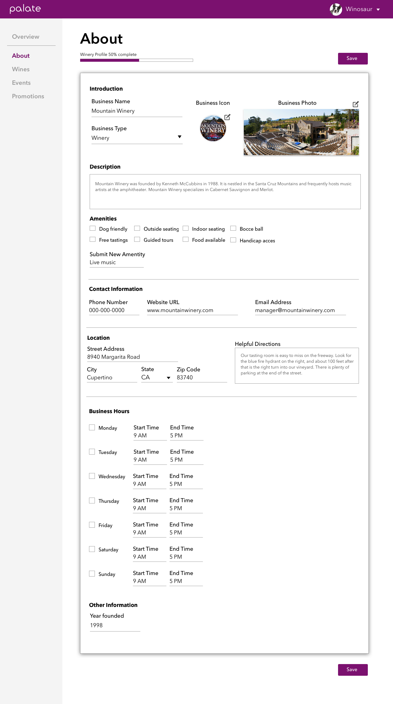
The product consists of a portal for winery owners to input their winery and wine information, which users can discover on the Palate app. Now that I had a better understanding of the business owners who'd be using the portal and what kinds of problems they needed us to solve, it was time to design a portal that had easy-to-use forms.
Forms are often a pain to fill out. How do we group the fields in a way that prioritizes information clearly? I tried placing the app next to the fields so that users could see how their entries would be reflected in the app. This placement would also build a foundation for the live preview we planned to include in the future. After getting buy-in for my Balsamiq prototype, I drew up the high fidelity version in Sketch.
Prototype
During our team review, with many fresh eyes looking at the design, it was clear that the layout would hinder mobile responsiveness. We suggested creating a design that mimicked the look and field order of the app. The result was a cleaner form that received more positive feedback.
Along the way, I created a sign up flow for logging in and resetting passwords. Onboarding is often the most crucial part of a user flow, so we had to determine the minimum amount of information we would need from the user before granting them an account. There was some complexity in that we already had some data scraped from the Web, and whenever a new user signed up we had to verify if they already belonged to an existing winery in the database.
I identified two flows: one that started with Palate contacting business owners, and the other starting with business owners signing up through our marketing page.
Implement & Test
Once the designs were nailed down, we started on implementation. I switched to a front-end developer role to redesign the existing portal and connect some additional fields to the database.
We're currently in the user testing phase. With more feedback, we'll know which features work best, and what we'll need to include in the next iterations.
Conclusion
Working with a team - even with non-designers - can yield good ideas during the design process. I'd like to say that I had a thick enough skin to not take things personally when people critiqued my designs. Everyone has the same mission to make the product better.
While designing, it's easy to start thinking about technical details when I know I'll be implementing the design later on. But while I'm wearing the design hat, I have to focus on the user experience.
The project is still ongoing and the portal is going through new and improved iterations. I am also working on user research for a wine recommender that's tailored to each person's level of wine knowledge. More details to come later.


